The problem
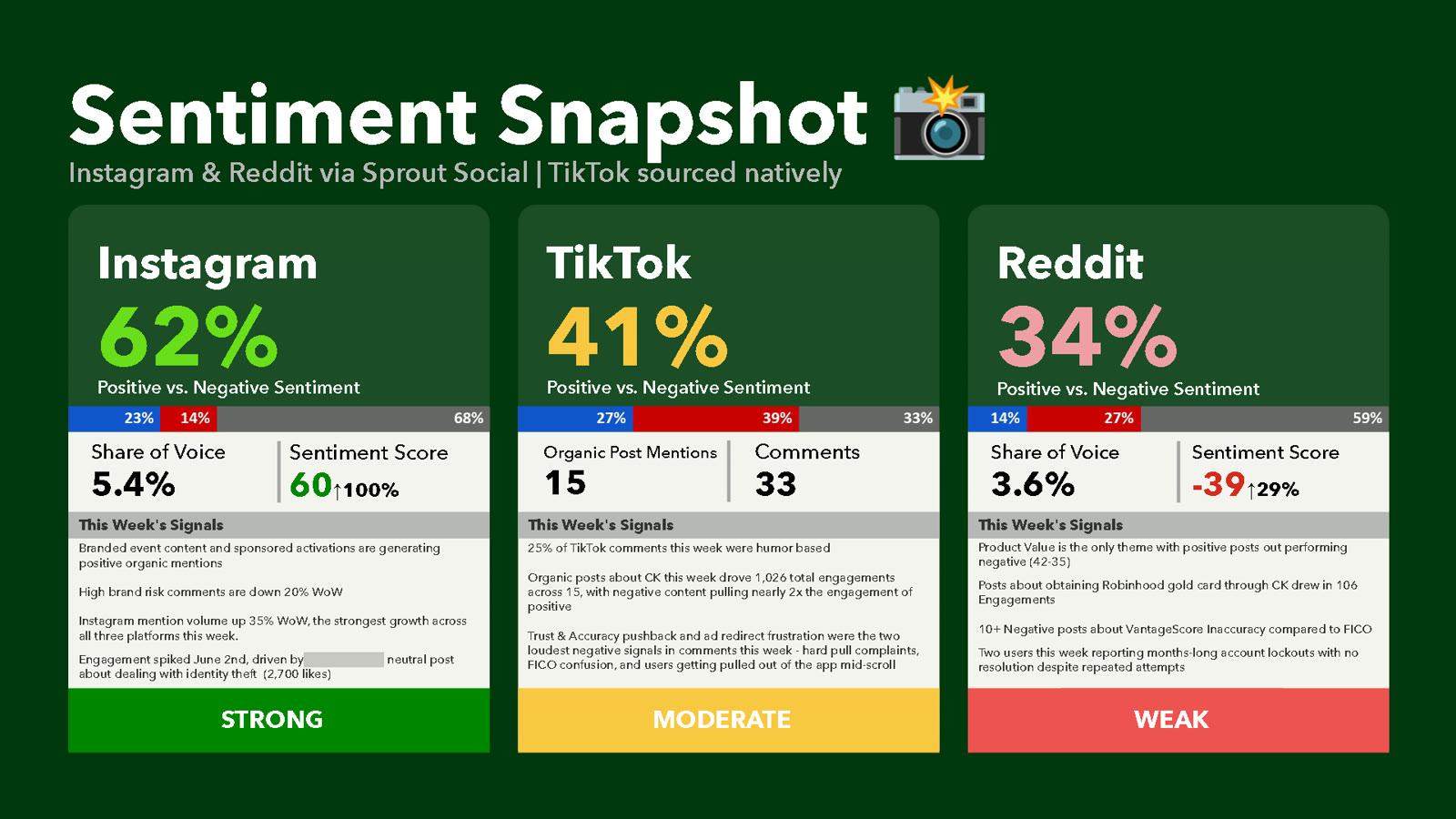
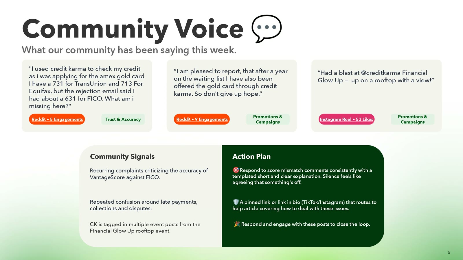
Credit Karma’s social team had plenty of data in Sprout Social, but no single weekly view of what the community was actually saying across TikTok, Instagram, and Reddit, or how that compared with competitors. Insight lived in dashboards that took time to read and were hard to share.
What I did
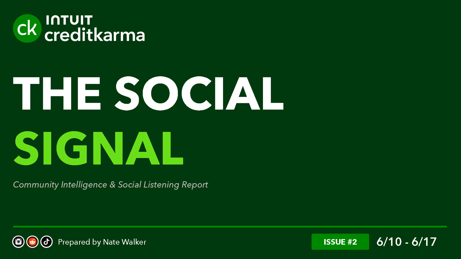
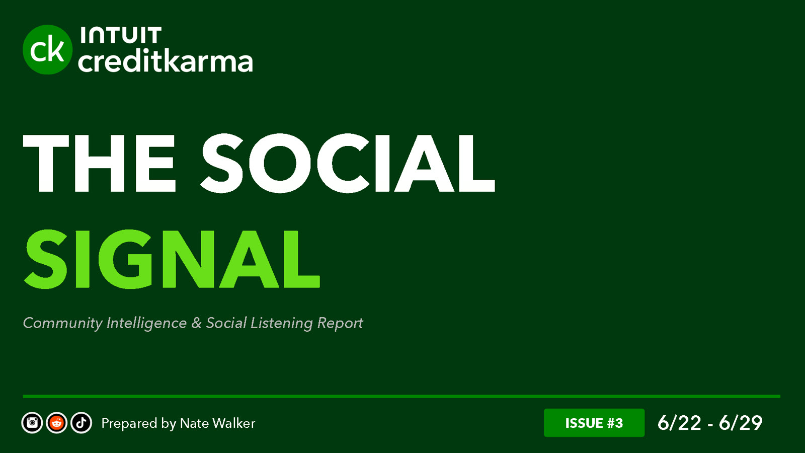
I designed The Social Signal from scratch: a short, visual report with the same structure every week, so readers always knew where to look.
Same format, new signal
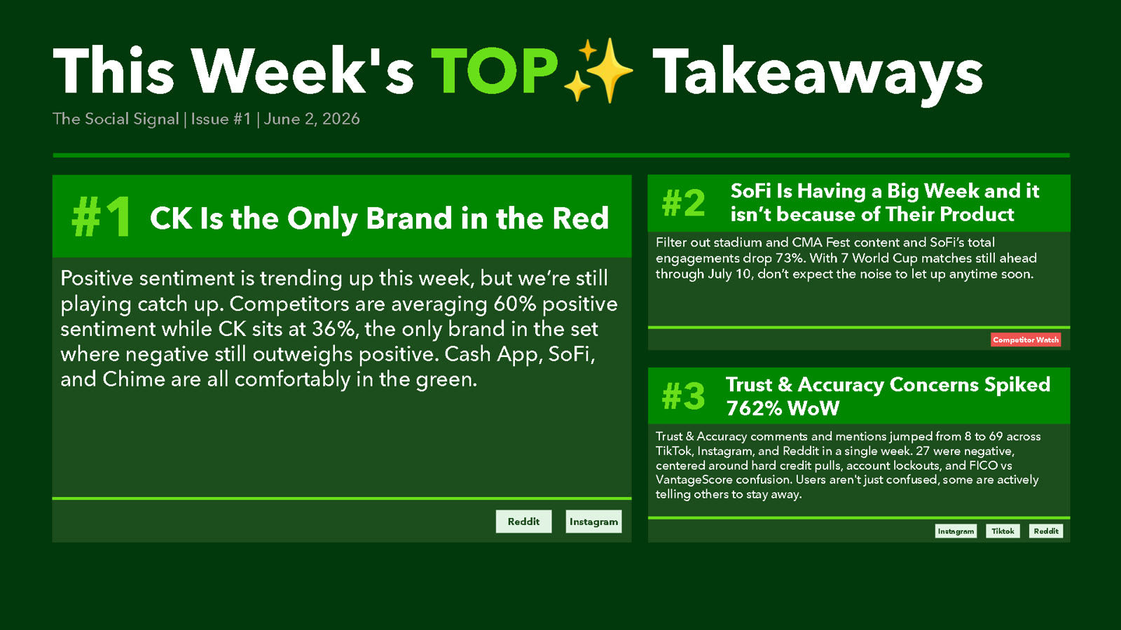
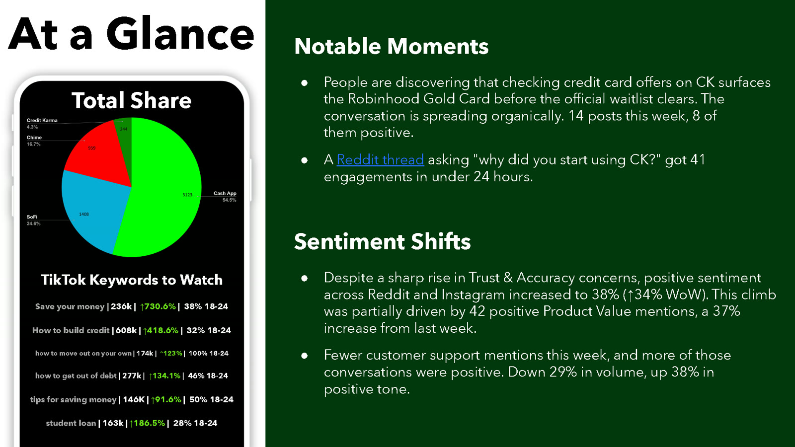
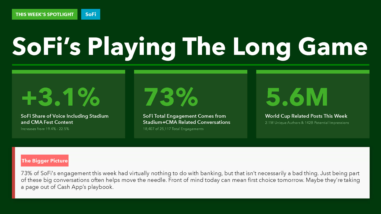
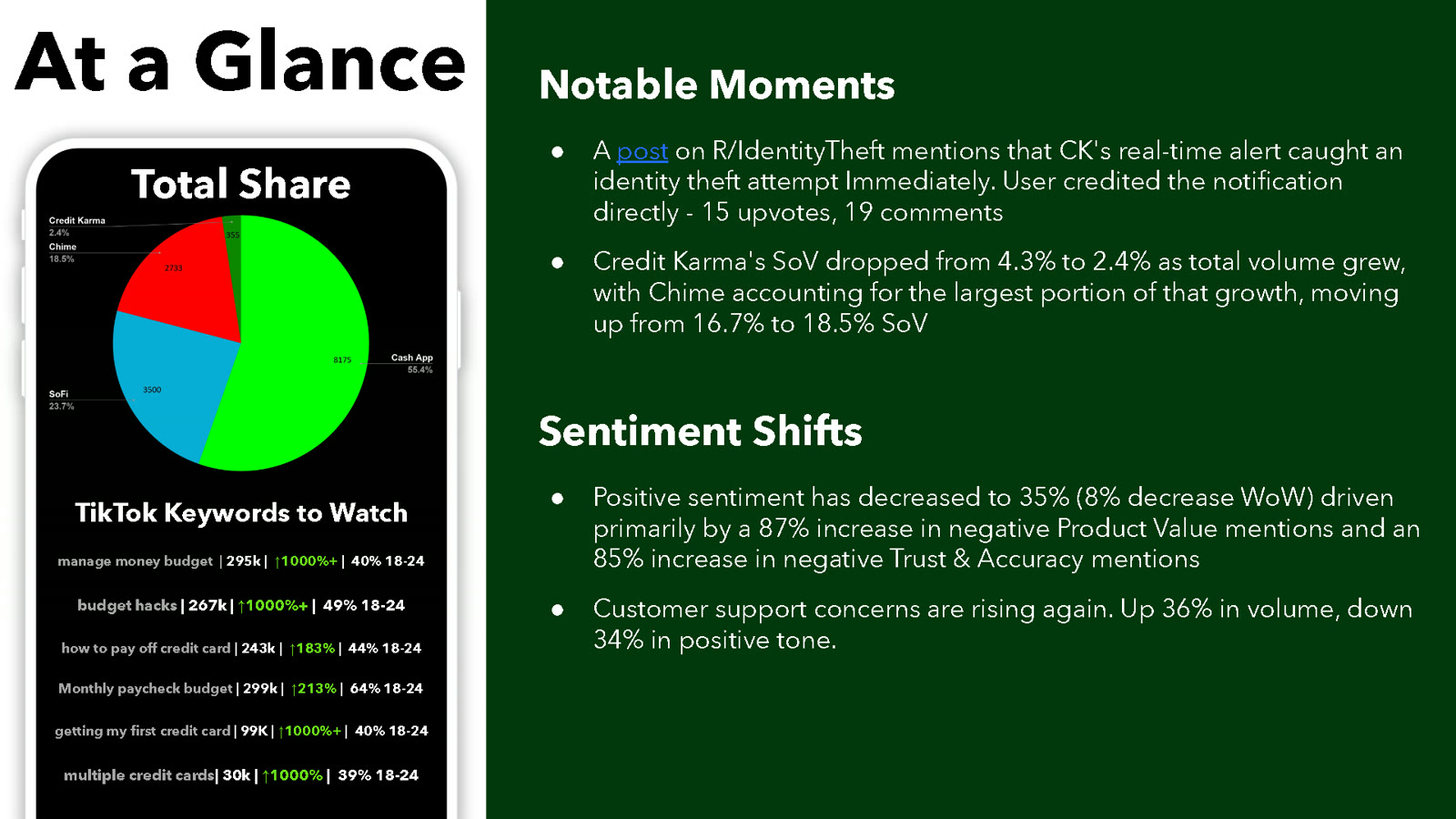
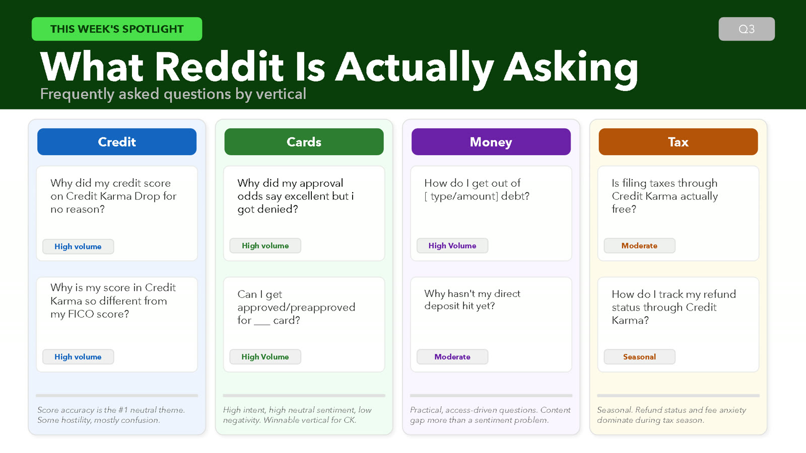
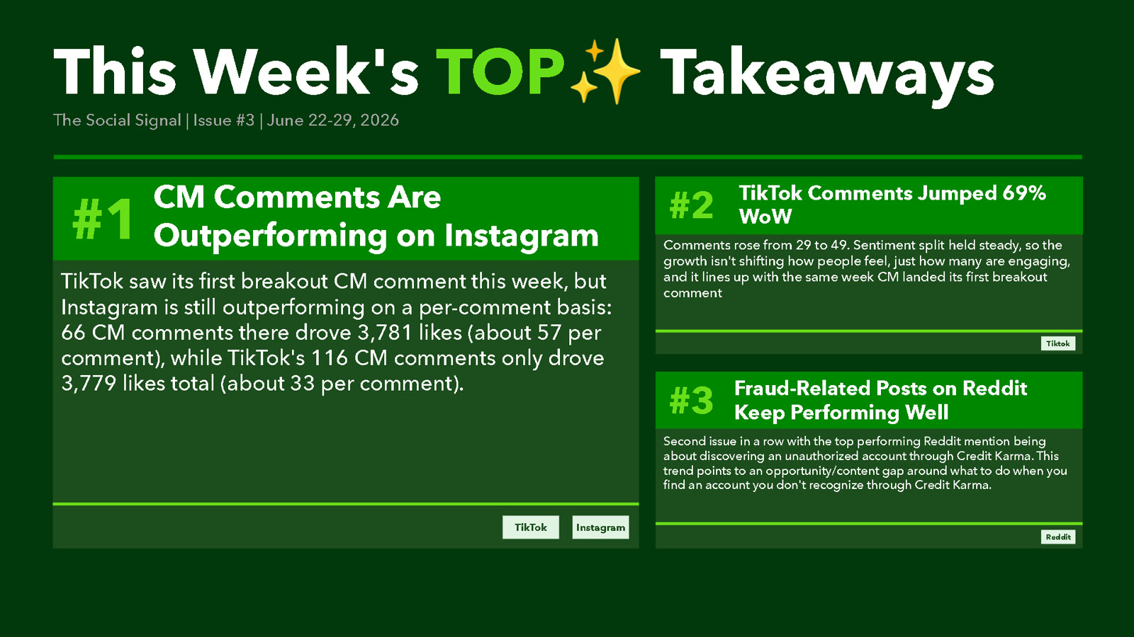
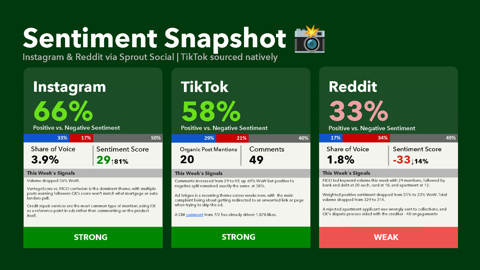
Each issue followed six fixed sections, from top takeaways to a deeper spotlight. A fixed format meant the team could skim it in minutes and compare week to week without relearning the layout.
Numbers with a “so what”
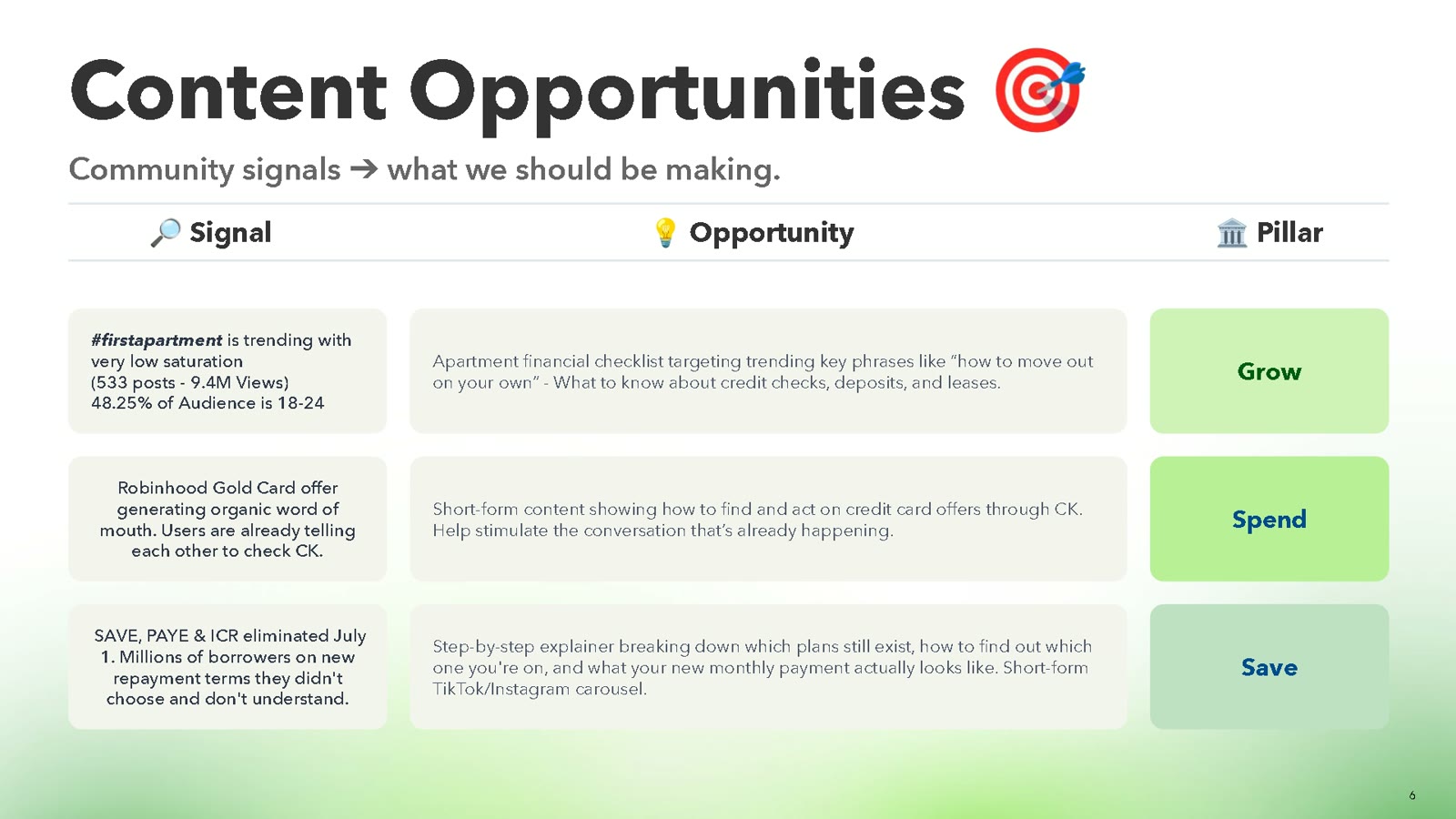
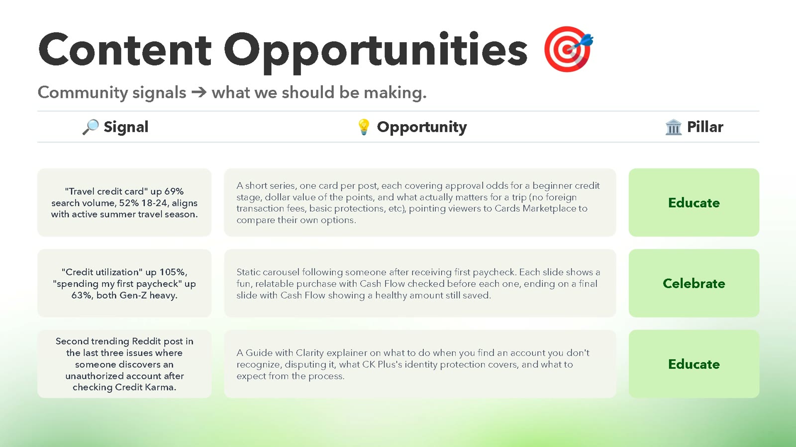
Every stat came with a reason it mattered and, where possible, an action. A sentiment dip came with the themes driving it. A trending keyword came with the content idea it pointed to.
Context, not just counts
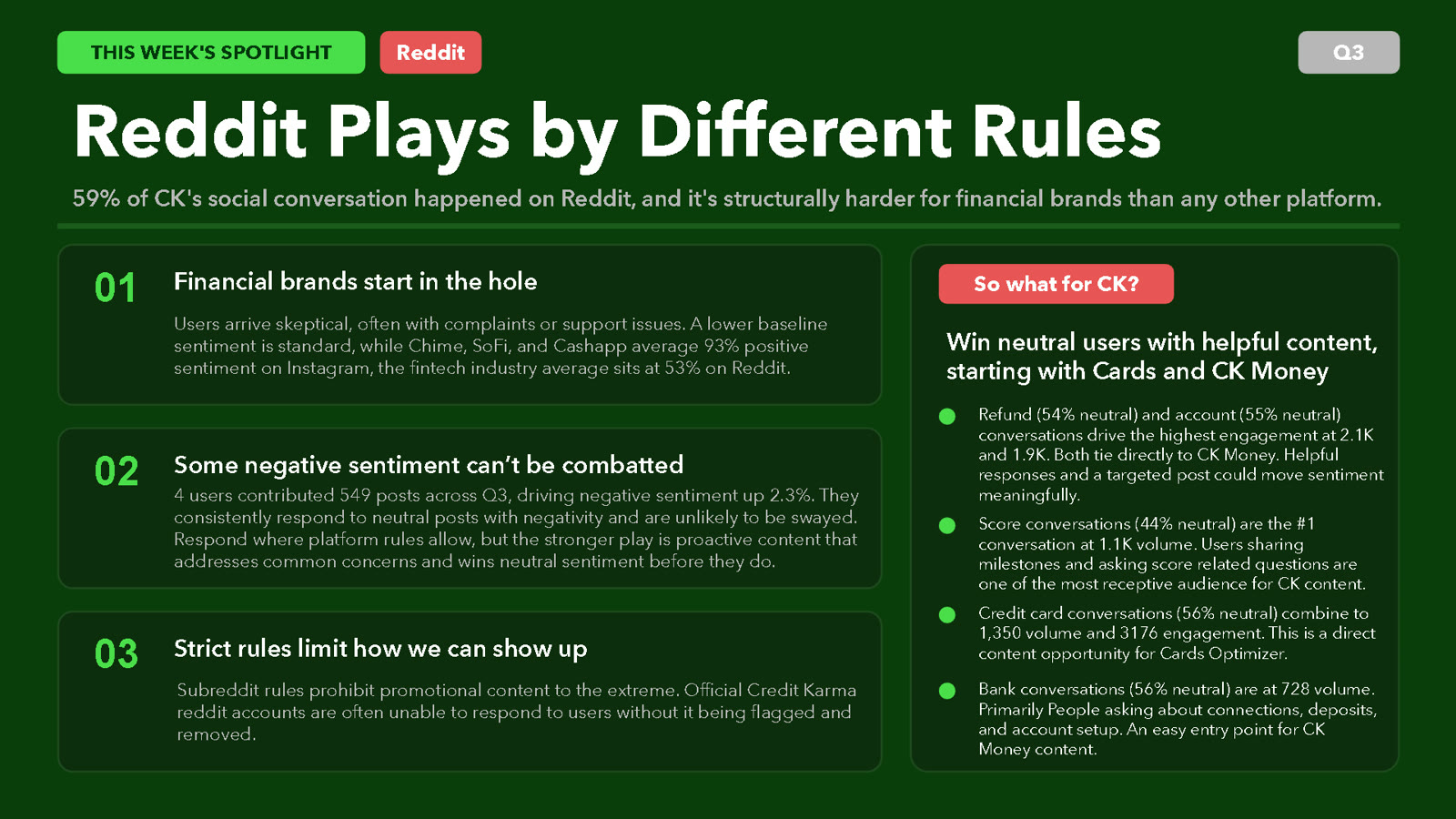
I tracked Credit Karma against Cash App, SoFi, and Chime, and called out when a number was misleading. In Issue 2, for example, I found that four Reddit accounts were behind 549 posts and a meaningful share of negative sentiment, which changed how the team should read Reddit’s numbers.
From listening to content
Every issue ended with content opportunities tied to real conversation, like a first credit card explainer when “getting my first credit card” was trending over 1,000% on TikTok.
The result
The report directly informed Credit Karma’s FY27 content strategy. Across three issues it surfaced eight content ideas, flagged a 762% spike in trust concerns, and gave the team a recurring read on where Credit Karma stood against competitors.
I ran it for three weeks, until my access to the analytics tools ended. The structure was built to be picked up and continued by anyone on the team.